All you need to know about CSS Transitions
CSS3 transitions bring simple and elegant animations to web applications, but there's a lot more to the spec than first meets the eye.
In this post I'm going to delve into some of the more complicated parts of CSS transitions, from chaining and events to hardware acceleration and animation functions.
Letting the browser control animations sequences allows it to optimize performance and efficiency by altering the frame rate, minimizing paints and offloading some of the work to the GPU.
Browser support
CSS transitions are supported in practically every version of Firefox, Safari and Chrome. They're supported in IE 10 and onwards. If CSS animations aren't supported in a given browser, than the properties will be applied instantly, gracefully degrading.
Webkit based browsers (Safari and Chrome), still require -webkit prefixes for animations and gradients, but these are soon being removed.
Applying transitions
A simple way of applying transitions is with CSS pseudo-classes, such as :hover. Notice we're specifying the property name, the length of transition, and one of the default timing functions, linear [demo].
.element {
  height: 100px;
  transition: height 2s linear;
}

.element:hover {
  height: 200px;
}
When the :hover pseudo-class is activated, the height will be transitioned linearly from 100px to 200px over a period of 2 seconds.
duration is the only required item in the transition shorthand. The browser defaults to a timing function of ease, and a property of all, unless these are provided.
We don't want to be restricted to using psuedo-classes when it comes to activating transitions - clearly that's not very flexible. The solution is to programmatically add and remove classes [demo].
/* CSS */
.element {
  opacity: 0.0;
  transform: scale(0.95) translate3d(0,100%,0);
  transition: transform 400ms ease, opacity 400ms ease;
}

.element.active {
  opacity: 1.0;
  transform: scale(1.0) translate3d(0,0,0);
}

.element.inactive {
  opacity: 0.0;
  transform: scale(1) translate3d(0,0,0);
}

// JS with jQuery
var active = function(){
  $('.element').removeClass('inactive').addClass('active');
};

var inactive = function(){
  $('.element').removeClass('active').addClass('inactive');
};
In the example above, we've got two different transitions, the element slides up when activated, and fades out when deactivated. All the JavaScript does is toggle the two classes active and inactive.
Transitioning gradients
Not every CSS property can be transitioned, and the basic rule is that you can only transition through absolute values. For example, you can't transition between a height of 0px to auto. The browser can't calculate the intermediate transition values, so the property change is instant. Oli Studholme has conveniently provided a full list of transition support properties.
The other major property that can't be transitioned between is background gradients (although pure colors are supported). There's no technical reason behind this limitation, it's just taking a while for the browsers to implement support.
In the mean time, there are a few good workarounds. The first involves adding a transparency to the gradient, and then transitioning between background colors. For example [demo]:
.panel {
  background-color: #000;
  background-image: linear-gradient(rgba(255, 255, 0, 0.4), #FAFAFA);
  transition: background-color 400ms ease;
}

.panel:hover {
  background-color: #DDD;
}
If the gradient is continuous, you can transition the background-position as documented here. Otherwise, your last resort is to create two elements, one overlaid on top of the other, and transition their opacity [demo].
.element {
  width: 100px;
  height: 100px;
  position: relative;
  background: linear-gradient(#C7D3DC,#5B798E);
}

.element .inner {
  content: '';
  position: absolute;
  left: 0; top: 0; right: 0; bottom: 0;
  background: linear-gradient(#DDD, #FAFAFA);
  opacity: 0;
  transition: opacity 1s linear;
}

.element:hover .inner {
  opacity: 1;
}
The caveats to the latter approach are that it does require extra markup, and the inner div can catch pointer events. Pseudo elements, such as :before and :after would be an ideal use-case here, but unfortunately only Firefox supports pseudo element transitions. Eliott Sprehn is working on support for Webkit, which is coming soon.
Hardware acceleration
Transitioning certain properties, such as left and margin causes the browser to recalculating styles every frame. This is fairly expensive, and can lead to unnecessary re-paints, especially if you have a lot of elements on the screen. This is especially noticeable in less powerful devices, such as mobiles.
This solution is to offload the rendering to the GPU using CSS transformations. In simple terms, this turns the element into an image during the transition, avoiding any style recalculations which greatly increases performance. A simple way of forcing the browser to hardware render an element is to set the transformation's z axis, which you can do with translate3d:
transform: translate3d(0,0,0);
Now, this isn't a magic cure to performance problems, and comes with lots of issues of its own. You should only use hardware acceleration when it's required, and certainly not enable it on every element.
For example, hardware acceleration can cause subtle font issues, such as a font appearing to lose its weight. This is due to a bug where subpixel anti-aliasing isn't supported when an element is being hardware accelerated. You can see a clear difference between the two rendering modes:

The short-term fix, albeit controversial, is to disable subpixel anti-aliasing completely. However, be sure to understand the caveats in doing so.
font-smoothing: antialiased;
In addition, different browsers use different hardware acceleration libraries, which can cause cross-browser problems. For example, whilst Chrome and Safari are both built on WebKit, Chrome uses Skia for graphics rendering while Safari uses CoreGraphics. The differences between the two are subtle, but real.
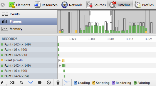
You can use Chrome's Inspector to Profile the page, showing all the repaints. Additionally you can show paint triangles in the Inspector's options, and even turn on Composited Render Layer Borders in about:flags to see which layers are operating on the GPU. The key is to reduce paints by batch updating the DOM, and move as much as possible to the GPU.
If you're having display issues between browsers with hardware acceleration, such as flickering or juddering, make sure you're not nestling elements with the transform3d() CSS property set. As a last resort, try having browser specific transformations.
It's worth noting that the translate3d hack is becoming less relevant. In fact recent builds of Chrome automatically use the GPU for opacity and 2d transitions. iOS6 Safari has explicitly disabled this trick, and requires yet more workarounds.
Clipping
To take advantage of GPU rendering, you'll need to avoid style recalculations by using CSS transformations rather than properties like width. What do you do though if you do need to animate an element's width? The solution is clipping.
In the example below, you can see a search box with two transition states. The second expanded state is hidden by a clipping element.
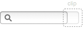
To transition to the expanded width, all we need to is translate the X axis left. The key thing here is that we're using translate3d rather than altering the element's width [demo].
.clipped {
  overflow: hidden;
  position: relative;
}

.clipped .clip {
  right: 0px;
  width: 45px;
  height: 45px;
  background: url(/images/clip.png) no-repeat
}

input:focus {
  -webkit-transform: translate3d(-50px, 0, 0);
}
By ensuring that we're not recalculating the element's width every frame, the transition will a whole lot smoother and performant.
Timing functions
So far we've been using some of the browser's pre-defined timing functions: linear, ease, ease-in, ease-out and ease-in-out. For more complex timing functions we're going to have to write our own timing function by specifying four points along a cubic-bezier curve.
transition: -webkit-transform 1s cubic-bezier(.17,.67,.69,1.33);
Rather than guessing at values, it's often easier to either use a bunch of pre-defined curves, or play around with a graphing tool.
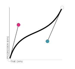
Notice you can drag the values out of bounds and produce a bouncing transition, for example:
transition: all 600ms cubic‑bezier(0.175, 0.885, 0.32, 1.275);
Programmatic transitions
Writing transitions in CSS is all very well, but sometimes you need a bit more control, especially when it comes to chaining transitions. Luckily we can not only invoke transitions from JavaScript, but also define them.
CSS transitions take a magical all property which ensures that any property changes are transitioned. Let's see how to use this in practice [demo].
var defaults = {
  duration: 400,
  easing: ''
};

$.fn.transition = function (properties, options) {
  options = $.extend({}, defaults, options);
  properties['webkitTransition'] = 'all ' + options.duration + 'ms ' + options.easing;
  $(this).css(properties);
};
Now we have this jQuery function $.fn.transition, which we can use to programmatically invoke transitions.
$('.element').transition({background: 'red'});
Transition callback
The next step to chaining transitions is having transition end callbacks. You can achieve this in Webkit, by listening to the webkitTransitionEnd event. For other browsers, you'll need to do a bit of sniffing to find the right event name.
  var callback = function () {
    // ...
  }

  $(this).one('webkitTransitionEnd', callback)
  $(this).css(properties);
Be aware that sometimes this event doesn't fire, usually in the case when properties don't change or a paint isn't triggered. To ensure we always get a callback, let's set a timeout that'll trigger the event manually.
$.fn.emulateTransitionEnd = function(duration) {
  var called = false, $el = this;
  $(this).one('webkitTransitionEnd', function() { called = true; });
  var callback = function() { if (!called) $($el).trigger('webkitTransitionEnd'); };
  setTimeout(callback, duration);
};
Now we can invoke $.fn.emulateTransitionEnd() before we set the element's CSS to ensure our transition end callback is triggered [demo].
$(this).one('webkitTransitionEnd', callback);
$(this).emulateTransitionEnd(options.duration + 50);
$(this).css(properties);
Chaining transitions
So now we can programmatically apply transitions, getting callbacks when they finish, we can start queuing transitions. We could write our own queue to do this, but as we're using jQuery we might as well tap into the library's existing functionality.
jQuery provides two main functions to communicate with its queuing API, $.fn.queue(callback) and $.fn.dequeue(). The former adds a callback to the queue, while the latter executes the next item on the queue.
In other words we need to set our CSS transition inside a $.fn.queue callback, and then make sure we invoke $.fn.dequeue when the transition is complete [demo].
var $el = $(this);
$el.queue(function(){
  $el.one('webkitTransitionEnd', function(){
    $el.dequeue();
  });
  $el.css(properties);
});
That's example is fairly simple, but it lets us build up complex chained animations, and even use jQuery's delay() function; for example:
$('.element').transition({left: '20px'})
             .delay(200)
             .transition({background: 'red'});
Redrawing
Often when transitioning, you'll have two sets of CSS properties. The initial properties that the animation should start at, and the final set of properties the transition should end on.
$('.element').css({left: '10px'})
             .transition({left: '20px'});
However, you'll find that if you apply both sets of properties, one immediately after the other, then the browser tries to optimize the property changes, ignoring your initial properties and preventing a transition. Behind the scenes, browsers batch up property changes before painting which, while usually speeding up rendering, can sometimes have adverse affects.
The solution is to force a redraw between applying the two sets of properties. A simple method of doing this is just by accessing a DOM element's offsetHeight property, like so [demo]:
$.fn.redraw = function(){
  $(this).each(function(){
    var redraw = this.offsetHeight;
  });
};
This will work in most browsers, but I've had occasions in Android where this hasn't been enough. The alternative is to either use timeouts, or by toggling a class name.
$('.element').css({left: '10px'})
             .redraw()
             .transition({left: '20px'});
The future
Transitions are being actively worked on, and the next spec looks really promising. The proposals include a new JavaScript API focussing on addressing some of the existing limitations to transitions, and giving developers much more flexibility.
In fact, you can find a shim on the new API on GitHub. It involves instantiating a Animation constructor, passing in an element to animate, the properties to animate to, and various other options such as a delay.
var anim = new Animation(elem, { left: '100px' }, 3);
anim.play();
With this new API you can synchronize animations, provide custom timing functions, and get completion callbacks. This is truly exciting stuff!
Transitions
By now, you hopefully have a deeper understanding of CSS transitions, and how a simple API can be combined to produce complex and rich effects.
Most of the JavaScript examples come straight out of the source of GFX, a jQuery CSS transition library. As well as the core library, I've included a number of additional effects, such as slide in/out, explode in/out and 3d flipping.
Thanks to Paul Irish for reviewing this article.
Incidentally, I've been turning the contents of this post into a talk. If you know or organize a conference that would be suitable for this material, please do get in touch! Over the last year I spoke at six conferences, and I'm keen to do even more in 2013.